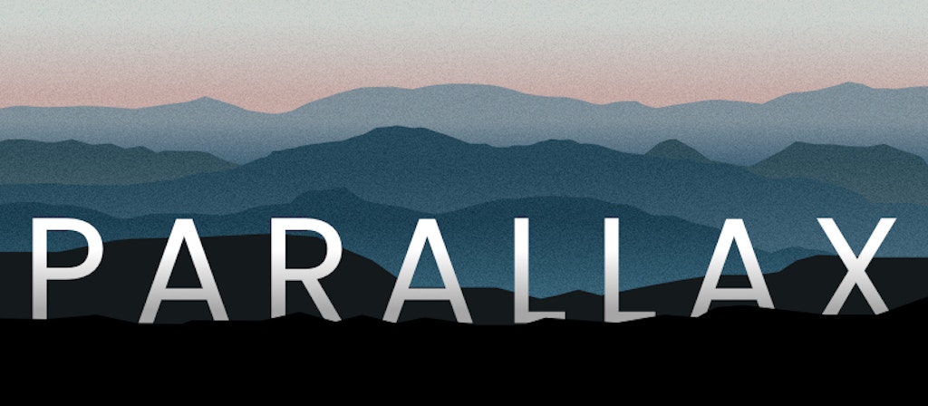
Two simple parallax methods
Parallax is a popular scrolling effect used on many modern websites, and when done well can look fantastic. Sadly though, parallax implementations often suffer from being JS heavy and poorly optimised, and can introduce performance problems. So, what are our options for adding a basic parallax style effect without any of the baggage?
What is parallax?
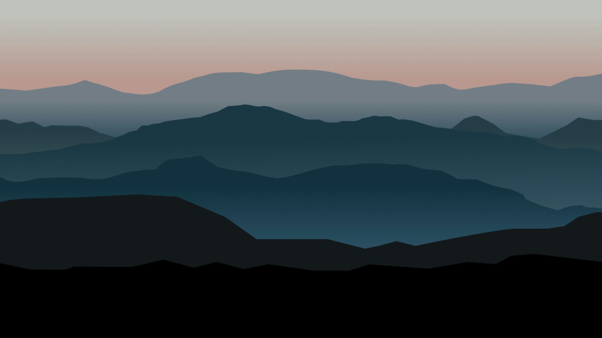
Parallax is an web design effect where the background content (usually imagery) moves at a different pace from the content in front of it when the user scrolls.
This effect is a big deal in the web design world, and doesn’t seem to be going away any time soon. There are currently 252 packages for parallax live on NPM – so perhaps it is a little overdone… 😉 That amount of interest does however indicate its popularity. When done properly*, parallax looks superb and adds engaging movement and dynamism to an otherwise static medium. Some of the most popular ‘wow’ websites will use parallax in ingenious ways to draw the user’s attention and direct their journey through the site.
Mostly, to achieve this effect on your website you would use a plugin or 3rd party library. To get the full parallax effect with no lag or glitchy movement can be complicated and to create your own component from scratch would be time-consuming and difficult, particularly when so many good open-source alternatives are available.
This doesn’t address the core problem of performance though – if you only want the parallax effect on a small area of your site, or are knocking up a proof of concept then why do you need a weighty, complex component?
We’ll show you two simple parallax-esque techniques which are perfect for small implementations – one using some simple Javascript, and the other using just CSS – wow!
Btw, we know that neither of these are technically actual parallax systems, hence the phrase ‘parallax-esque‘. However, we also reckon that words evolve, and so to the average web user ‘parallax’ means anything that looks as if two components are moving at different speeds or in opposing directions, sorry 🙂
CSS approach
We’re going to use a technique which makes use of the ‘background-attachment‘ property in CSS to approximate a parallax style effect.
How it works:
Setting ‘background-attachment‘ to ‘fixed‘ will cause the item’s background image to be set as fixed to the viewport rather than the item itself. This means that it will not scroll up with the item, but instead seem to remain pinned in place. The result is a kind of trick of the eye. The item’s background is in fact moving along with the item, but because its position updates itself to match the viewport we get the impression that we are ‘wiping’ the image away, or perhaps moving clear glass windows over a bottom layer.
This is a nice approach because it is so simple! You need hardly any lines of code, and being CSS only means that it is far more performant than a JS solution. Equally, it doesn’t mess with your page structure – as you can see from the Codepen example below, this setup allows you to add content sections in the middle of parallax images without messing up the effect.
Browser support is good, with the irritating downside that some mobile browsers can mess this up, but fortunately this ought to just fall back to a basic relative layout.
Code:
.parallax-image {
    position : relative;
    height : 100vh;
    background-attachment: fixed; // key
    background-position: top center;
    background-size: cover;
}
Example:
https://codepen.io/pxpxltd/pen/oErmWy
See the Pen Simple parallax with CSS by Pixel Pixel (@pxpxltd) on CodePen.
JS Approach
This version is a technique which is also based on a CSS background property, but instead uses ‘background-position‘ to update a dynamic positioning of the background image within its container, offering a more subtle effect whereby the image will appear to move upwards just slightly faster than the containing element.
How it works:
The effect works because setting a background image’s ‘background-position’ property to a minus value will move its position upwards within its container, laying its top edge outside of (and hidden by) the container’s top edge.
If we set the image to be exactly the same size as the container then the image would appear to move upwards, leaving a gap – this is where setting ‘background-size‘ to larger than 100% comes in. Obviously this niggle might be a drawback for your use case, but using a large enough image should negate this. The speed is what defines the rate at which the background image should travel upwards. It is divided into the the user’s current YOffset location as prompted by the scroll input, so to reduce the rate of travel you would need to increase this value.
This is a handy little tool because it requires only a few lines of Javascript and can be applied to content without messing up your html structure. If the script is not applied, then just like with the CSS example you should fall back to your initial relative layout. This technique is best suited for use with only one or two images max due to the inherent downsides of the technique, and we wouldn’t recommend it for anything complex. That said, it can be great for adding some very subtle movement to a banner or a focal image, or simply for demonstration purposes in a proof of concept!
Code:
JS:
const parallaxElements = [...document.getElementsByClassName('parallax')];
const parallax = function(img) {
    const speed = 3;
    let pos = '-' + (window.pageYOffset / speed) + "px";
    img.style.backgroundPosition = `center ${ pos }`;
}
window.addEventListener('scroll', function(e) {
    parallaxElements.forEach( (img) => {
        parallax(img);
    });
});
CSS:
background-image: /* image url */ ;
background-size: 125%; // or whatever you like, but larger than 100%
background-repeat: no-repeat;
background-position: center 0px;
Example:
https://codepen.io/pxpxltd/pen/VQJooQ
See the Pen Simple parallax with JS by Pixel Pixel (@pxpxltd) on CodePen.
Hopefully, you’ll give these techniques a try! We reckon the CSS one is particularly suited for use on production sites and the JS version well-suited to proofs of concept and smaller implementations.Let us know how you get on with them or get in touch if we can help you with parallax or anything else to do with web design and development.
References:
- https://developer.mozilla.org/en-US/docs/Web/CSS/background-attachment
- https://caniuse.com/background-attachment
- https://developer.mozilla.org/en-US/docs/Web/CSS/background-position
- https://developer.mozilla.org/en-US/docs/Web/API/Window/pageYOffset
* some great examples of parallax sites done well can be found here:
- https://www.awwwards.com/30-great-websites-with-parallax-scrolling.html
- https://www.creativebloq.com/web-design/parallax-scrolling-1131762
By: Chris Snowden