
Accessibility – Colour-blindness in web design
Websites nowadays are vibrant and artistic products packed with unusual features and quirky colour schemes, but our industry often fails to remember that not all of our users are receiving the full impact of these design decisions.The level of colour blindness present in the population at large varies depending on genetic makeup, but is generally estimated to affect 8% of men and 0.5% of women worldwide, with Caucasian populations suffering higher incidences. The term colour blindness covers a range of conditions of varying severity, but loosely refer to limitations on a individual’s correct perception of part of the colour spectrum. Consideration of accessibility issues such as colour blindness alongside other visual impairments and physical restrictions is very important in ensuring a consistent, fair and inclusive UX approach.
Some of the main colour deficiencies and their potential impacts:
- Trichromacy
- Normal colour vision – Uses all three types of light cones correctly. E.g. red/blue/green all visible and identifiable.
- Anomalous Trichromacy
- Partial failure in one of the three light cone types. Light perceived slightly out of alignment, often confusing hues rather than complete misidentification. Most common.
- Dichromacy
- Complete failure in one of the three light cone types. Unable to perceive this colour at all.
- Monochromacy
- Inability to see any colour at all. Colours are perceived in grayscale, on a range between white and black, rather like a black and white television set. Extremely rare, affects roughly 1 in 33,000 people.
For Trichromacy and Dichromacy sufferers, their particular colour-blindness is defined by the spectrum they lack. e.g. red/green/blue. Green light weaknesses are the most common, followed by red, with blue extremely rare.
- Protanomaly/Protanopia – Reduced capacity for red light.
- Deuteranomaly/Deuteranopes – Reduced capacity for green light.
- Tritanomaly/Tritanopes – Reduced capacity for blue light.
In design
Currently, great emphasis is placed on colour theory in an attempt to provoke in the user a particular feeling or a specific impulse, and companies like Amazon make great use of this tactic. They make use of brightly coloured yellow and orange prompts to highlight call-to-action buttons and impress urgency on the user as well as establishing a set of clear and persistent reference points. Bright colours like yellows and oranges suggest velocity and excitement – take a look at the Kindle store and count how many book covers feature heavy use of yellows! Apple have however taken the polar opposite approach, moving away from their original rainbow logo in 1998 in order to foster a sense of elegance and luxury in their brand. The original logo “no longer spoke to their product line, now known for simple, intuitive, sleek technology”.
This targeted, planned approach to the use of colour perception is subliminal, subconscious and highly suggestive. It has been proposed that up to 90% of snap judgements about products can be based on colour alone, and that adverts in colour are read up to 42% more often than black and white ones! Clearly colour is very important in defining how we feel about a product, but also in providing indications of how we should behave. Imagine warning signs, error messages, traffic lights…colour is often a key component to our standardised behaviour patterns. As the effects of a colour blindness deficiency can range from almost normal colour vision to the total absence of a particular faulty spectrum, web designers must be aware that a substantial tranche of their users may not be receiving the experience that was intended – the psychological and artistic effects of your carefully picked colours might be lost on one tenth of your market!
Case Study
To highlight some of the considerations to be taken when designing your website with colour-blindness in mind, we will briefly discuss a snippet from one of the projects which really drove home to us at Pixel Pixel how accessibility concerns can affect a site, and how we should consider them during the development process rather than as an afterthought.
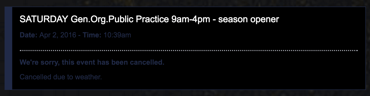
When launching a new site for MountainView MX Park in the USA, we needed to introduce a feature which would let the owners display upcoming event details. This would involve adding a bold, clear UI to distinguish both the category of event and its status. In particular, adding a striking “cancelled” state. Generally when wanting something to stand out as a “warning/error” designers will colour it so that it stands out from the rest of the website, forcing the user to pay attention.
In this instance we decided on using a bright shade of red for the text and border, and the alert seemed to be very clear and authoritative. Unfortunately, this failed to consider colour-blindness. Considering Protanomaly/Protanopia, we can see that shades of red will often be seen as muddy blacks and blues. Add to this the black background we had chosen and when viewed through the prism of a colour-blind person, the warning text becomes very challenging to read.
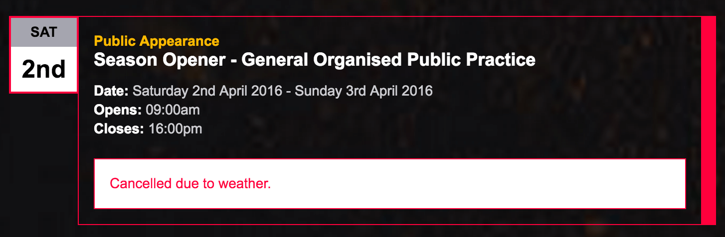
The below image shows the original design and colour of the cancelled event. The red allows the item to stand out and grab the users attention, but look at the next image and the problem becomes apparent.

As you can see, with the colour spectrum changed to represent what a person suffering from Protanomaly would see, the reds shift to a very dark blue.
This was obviously not ideal. Pixel Pixel want to ensure that our websites are as accessible as possible and are reaching the widest possible audience. We started going through our available colour palette and considering some design changes that would make the cancelled events accessible to all visitors. We eventually settled on a new design which allowed for better use of colours and a more structured look and feel overall.
We decided to leave the red border in as this still grabbed the attention of the non-colour blind user, but additionally added a white box with the cancellation reason in red text. Red on white is a lot easier to read than red on black! Consider the next image to see the potential result when a person suffering with Protanomaly views it.
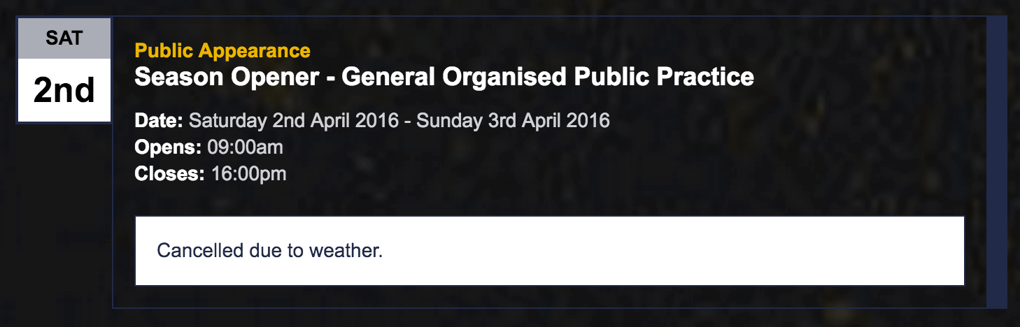
Much better. All the text is visible and clear. The message may not be quite as striking for a colour blind user but the necessary information has been communicated effectively.
Further Reading
For more information on colour blindness and some further reading, please visit:
- Color Blind Awareness
- National Eye Institute (NEI)
- Tutsplus on colour blindness design
- Template Monster on colour blindness design
We recommend using a browser extension to allow you to test for various colour deficiencies directly in the browser. Such as:
Consider that colour blindness could affect one tenth of your potential user base. Web accessibility concerns are not just a moral responsibility, but also a business necessity!
If you ever have any issues with our website, please do get in touch and let us know about it, and we’ll try our best to get it fixed!
By: Chris Snowden